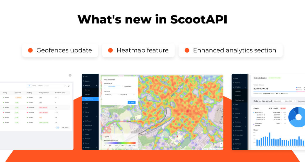
Our team continues to integrate new features into the ScootAPI software to improve clients’ interaction with the platform. Over the past months, we have implemented a number of important changes, focusing on expanding analytics capabilities, as well as tools for managing geographical zones and visualizing data. In this overview, we are pleased to present the latest updates that will greatly improve your experience with the ScootAPI platform.
Increase trip volume with HeatMap
One of the most anticipated updates is the HeatMap feature. The tool presents a map that visualizes the frequency of scooter usage in the city with different colors directly in the admin panel. The new feature is available to all our clients within the analytics section.
HeatMap allows tracking popular spots where users most frequently pick up and drop off scooters, which is important for efficient transport management and scooter deployment across the city. For example, using the feature, it’s possible to identify areas and times of scooter shortages and preemptively relocate scooters from less-demanded areas to these city points. To get a closer look at popular spots and the number of scooters in them, simply zoom in on the map and enhance the image.
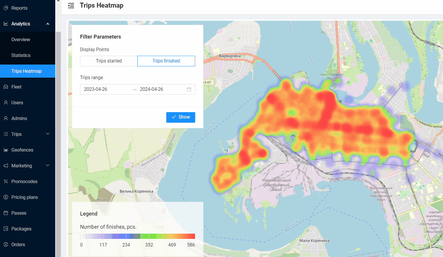
The feature also includes filters. With them, users can select the display of points on the map based on trip start or finish and specify the period during which trips were made to analyze service usage in seasonal months.
Efficiently manage geographic zones with Geofences
The Geofences is one of the most popular sections in the ScootAPI admin panel. The functionality provides administrators with the ability to configure various parameters and restrictions for vehicles in individual zones, as well as control the rules of their usage.
For example, with Geofences, it’s possible to limit the maximum speed or prohibit parking of electric scooters in a specific area. This feature allows optimizing fleet management, ensuring safety and compliance with traffic rules.
Futhermore, by using this feature, it’s possible to positively impact trip volume, for instance, by offering users more favorable conditions in less-popular areas.
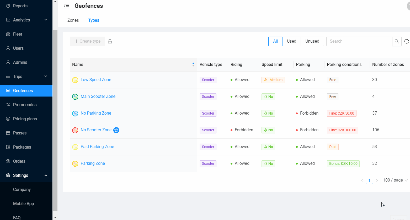
The main goal of the Geofences update was to make the feature more intuitive and convenient for our clients. We have improved the interface and now all zone types can be viewed in one window without wasting time switching between tabs and searching for the necessary information. Zone types are presented in the form of a table with the main characteristics of each zone: type of devices, permission to travel, parking, speed limit, etc.
In addition, Geofences now includes:
— the ability to see to which types of devices a particular zone applies;
— color icons for quick correlation of type and zone on the map;
— filtering by zone type usage status;
— title search to help you find the zone you are looking for faster.
The important functions of Geofences have been retained in the updated version. As before, you can change the amount of bonus or penalty in the zone type, as well as draw and customize zones directly on the map.
Get reliable information on your business state thanks to the Analytics section
The ScootAPI team put the most effort into improving the analytics dashboard. It helps businesses find new points of growth, manage risks and make strategic decisions based on real numbers.
First of all, we added a new section to the analytics — Statistics. We tried to make it convenient and informative for our clients, supplementing the figures with a variety of graphs and visual dynamics.
The “Statistics” section includes several groups of widgets that reflect data on credits, debits and bonuses for a certain period of time:
— “Credits” widget shows the total amount of credits to the business account, dividing them into replenishment of wallets and purchase of subscriptions.
— “Charges” shows the total amount of debits from users’ wallets and cards, detailing them by category.
— “Bonuses” displays the number of bonuses credited to users, categorized by category.
Additional features include widgets “Average Revenue by Scooter”, “Average Charges” and “Average Check per Trip”, which allow you to analyze financial data for the selected period in more detail.
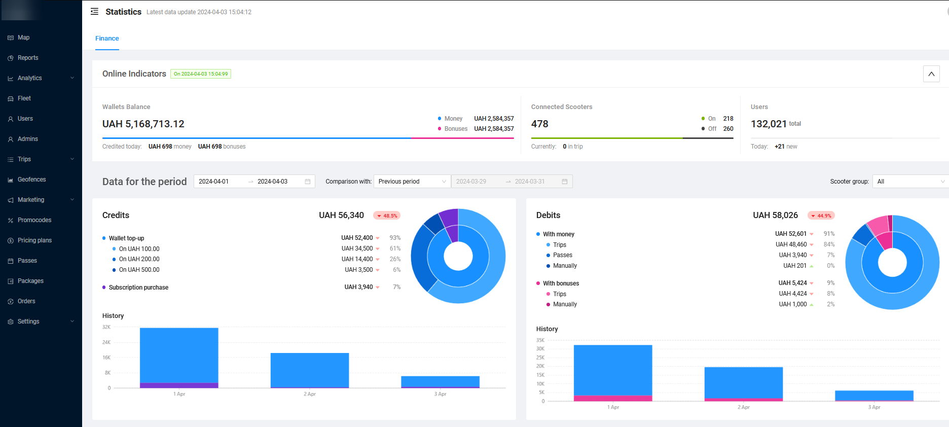
All data in this section is automatically updated every hour. To better understand the share of each category of debits and credits, percentages are shown next to the absolute figures. In addition to numerical values, all data is presented in the form of diagrams.
Within a single widget, you can view charts for one or more categories. You can easily control the data display by disabling or enabling the categories of interest with a single click.
Besides to pie charts, inside each widget there is an additional chart that allows you to track metrics in dynamics depending on the selected period: by hours, days and months.
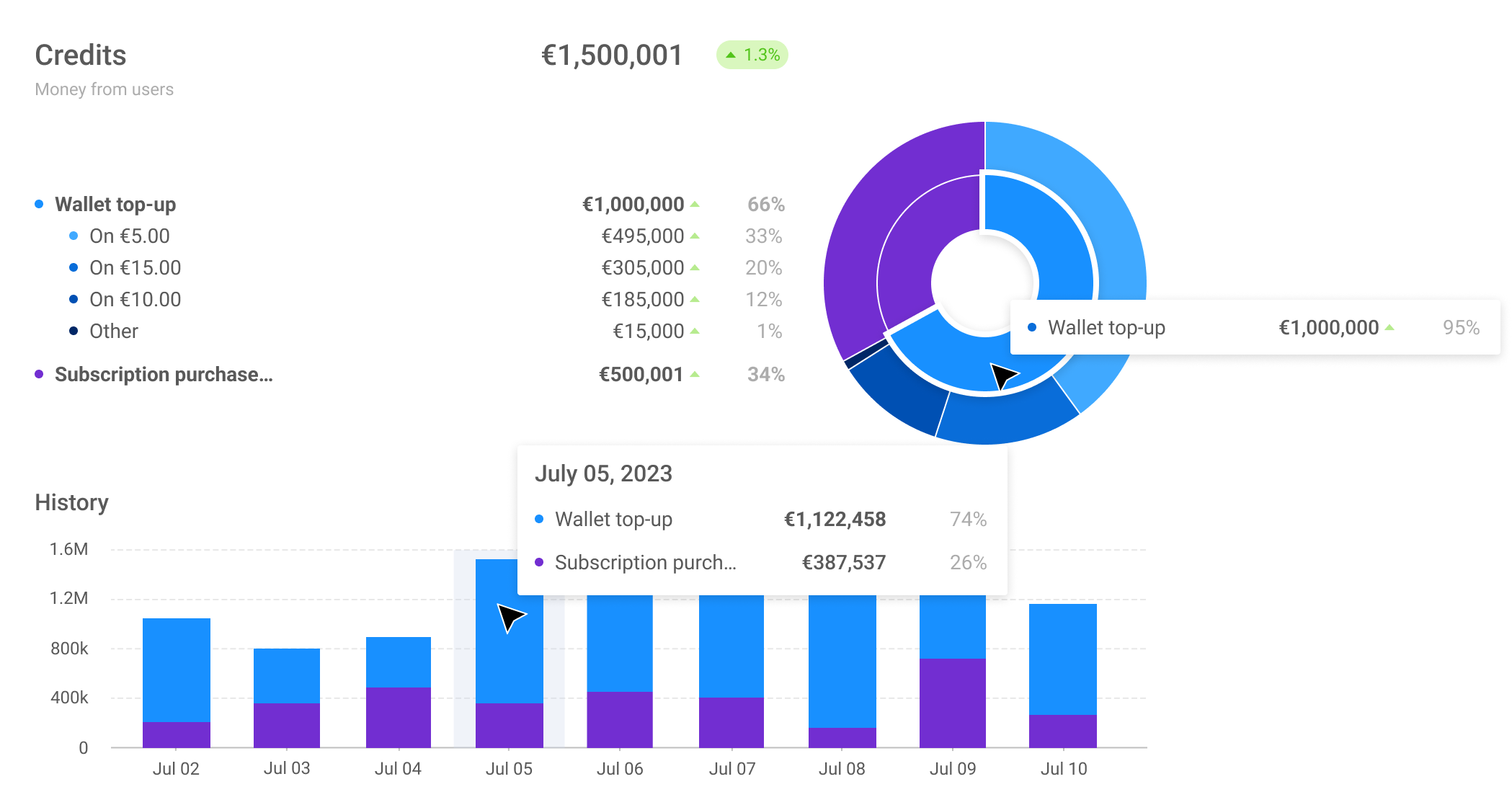
In the latest update, we further improved analytics on finances and added the ability to compare data by period. In the comparison mode, color indicators have appeared, which help to read the dynamics more easily and track the growth or decline of the indicator.
All new features and updates are already available for our customers. If you would like to learn more about the ScootAPI platform, leave a request for a free consultation. Our experts will show you how ScootAPI can help you launch and grow your shearing business